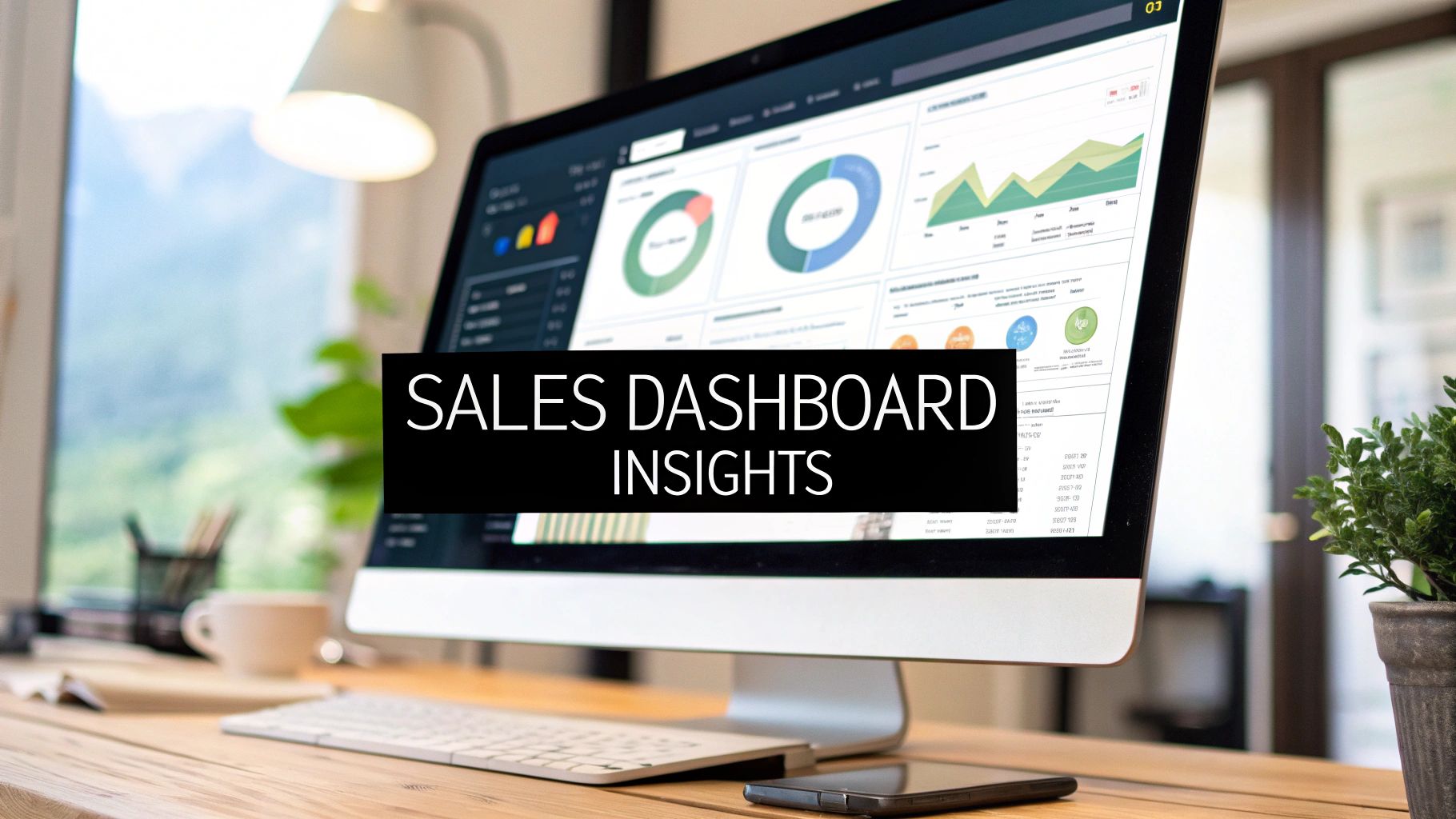
Unlocking Your Sales Potential: Visualising Success in 2025
Is your sales team’s critical data trapped in messy spreadsheets, lost in chaotic WhatsApp groups, or scattered across systems with no clear lead ownership? For sales managers and franchise owners, this lack of visibility is a direct obstacle to growth. Converting raw data into a clear, strategic advantage is the core challenge, and the solution lies in a well-designed sales dashboard. A powerful dashboard isn't just a reporting tool; it’s a strategic command centre that transforms confusion into actionable insights, fuelling revenue and motivating your team.
This article moves beyond generic templates to deliver a deep, strategic analysis of effective sales performance dashboard examples. We will break down eight distinct dashboard types, dissecting the key metrics and layouts that drive success for specific business needs, from individual rep scorecards to high-level revenue analytics. You will learn not just what to track, but why it matters and how to implement these visualisations for your own operations. Our focus is on providing replicable methods and tactical insights that you can apply immediately to organise your sales process, clarify lead ownership, and scale your field sales operations effectively. Let’s explore how to visualise your path to success.
1. The CRM-Integrated Sales Funnel Dashboard
The CRM-Integrated Sales Funnel Dashboard is the bedrock of any data-driven sales operation. It serves as a visual, real-time representation of your entire sales pipeline, pulling data directly from your Customer Relationship Management (CRM) system. This direct integration ensures the dashboard is a single source of truth, eliminating the messy spreadsheets and data discrepancies that plague many growing teams. This is one of the most essential sales performance dashboard examples because it provides an immediate, high-level overview of pipeline health and momentum.
This dashboard is crucial for sales managers at scaling companies, especially in field sales, telecommunications, or any industry with a multi-stage sales process. It moves your team from being reactive-fixing problems after deals are lost-to being proactive. You can spot where leads are stalling, identify bottlenecks, and intervene before potential revenue evaporates.
Strategic Analysis and Tactical Insights
The power of this dashboard lies in its ability to translate raw CRM data into actionable intelligence. The classic funnel visualization immediately shows the volume of leads at each stage, from initial contact to a closed deal.
- Key Metric Breakdown: Instead of just tracking wins and losses, this dashboard focuses on the journey. Metrics like conversion rate per stage reveal which parts of your sales process are effective and which need refinement. For example, a low conversion rate from "Demo Scheduled" to "Proposal Sent" might indicate a weak product demonstration or a qualification issue.
- Deal Velocity: This metric tracks the average time a deal spends in each stage. A slowing velocity is an early warning sign. It could mean reps need more training, marketing materials are ineffective, or competitors are becoming more aggressive. By monitoring this, managers can diagnose issues before they impact quarterly targets.
- Automated Data Sync: The "integrated" part is non-negotiable. Set up an automated, real-time or near-real-time data sync between your CRM and your dashboard. This ensures every new lead, status update, and closed deal is reflected immediately, making the dashboard a true mirror of your team's daily activities.
- Custom Stage Definitions: Your dashboard’s funnel stages must perfectly match your team's real-world sales process. Generic stages like "Lead," "Opportunity," and "Closed" are insufficient. Define custom stages that reflect your specific milestones, such as "Initial Contact," "Site Visit Completed," "Quote Delivered," and "Contract Signed." This customization provides unparalleled clarity.
Actionable Takeaways for Implementation
To make this dashboard a central part of your strategy, focus on proactive management. Use the stage-by-stage conversion data to pinpoint coaching opportunities for individual reps. If one salesperson consistently struggles to move deals past the proposal stage, you have a specific, data-backed reason to provide targeted training.
Furthermore, use the insights on deal velocity and stage conversion rates for more accurate sales forecasting. By understanding historical performance at a granular level, your revenue projections become far more reliable. This allows for better strategic resource allocation, helping you decide whether to invest in more lead generation, sales training, or technology to streamline a specific part of the funnel. For a deeper dive into creating this foundational view, you can explore the specifics of what makes a CRM-integrated dashboard effective. Learn more about the CRM-Integrated Sales Funnel Dashboard on salesdash.com.
2. The Individual Sales Rep Performance Dashboard
The Individual Sales Rep Performance Dashboard shifts the focus from the team-wide pipeline to the performance, activities, and outcomes of a single salesperson. This personalised view is a powerful tool for coaching, motivation, and accountability. It provides a transparent look at a representative's progress against their quotas, their historical performance, and how they stack up against team averages. As one of the most effective sales performance dashboard examples, it gamifies the sales process and fosters a culture of continuous improvement.

This type of dashboard is indispensable for sales managers in any commission-based or territory-driven industry, including home services, telecommunications, and field marketing. It's crucial for turning performance reviews from subjective conversations into data-backed coaching sessions. By tracking both effort and results, managers can pinpoint exactly where a rep excels and where they need support, ensuring every team member is equipped to succeed.
Strategic Analysis and Tactical Insights
This dashboard’s value comes from its blend of outcome metrics (the "what") and activity metrics (the "how"). It creates a complete picture of an individual's work ethic and effectiveness, moving beyond a simple "deals closed" count.
- Key Metric Breakdown: A balanced view is essential. Track outcome metrics like Revenue Generated, Quota Attainment %, and Average Deal Size. Simultaneously, monitor activity metrics such as Calls Made, Emails Sent, Meetings Booked, or Doors Knocked. A rep with high activity but low outcomes might need coaching on their pitch, while one with low activity but high outcomes could be a candidate to share best practices.
- Performance Benchmarking: Context is key to performance data. The dashboard should compare the individual’s metrics against three crucial benchmarks: their own historical performance, their current quota, and the team average. This helps reps understand their standing and provides managers with an objective basis for evaluation and encouragement.
- Leaderboard Integration: Incorporating a leaderboard element gamifies performance and sparks healthy competition. Displaying rankings for key metrics like "Appointments Set" or "Revenue Closed" can be a powerful motivator, especially for competitive, commission-based sales teams. It encourages peer-to-peer learning and celebrates top performers.
- Activity-to-Outcome Ratios: Analyse the ratios between activities and results. For instance, what is a rep's "Dials to Conversation" ratio, or their "Meetings to Closed Deals" ratio? This reveals their efficiency at each stage and uncovers specific skill gaps that need attention, transforming raw data into a precise coaching roadmap.
Actionable Takeaways for Implementation
To maximise this dashboard's impact, use it as a foundation for regular, one-on-one coaching sessions. Frame the data positively, focusing on growth opportunities rather than just pointing out shortfalls. Celebrate improvements in activity metrics, even if they haven't yet translated into closed deals, to reinforce positive habits.
Set realistic and individualised targets that stretch reps without demoralising them. Use the dashboard to facilitate conversations about what's working and what isn't, empowering reps to take ownership of their performance. This data-driven approach builds trust and shows that management is invested in their personal development, leading to higher engagement and better retention. For more on structuring these views, you can research individual performance tracking in platforms like Salesforce. Learn more about the Individual Sales Rep Performance Dashboard on salesdash.com.
3. The Revenue Analytics Dashboard
The Revenue Analytics Dashboard provides a high-level, financial-focused view of your sales operation's direct impact on the bottom line. It moves beyond operational metrics like call volume and focuses purely on financial outcomes, making it indispensable for executives, finance leaders, and sales directors. This dashboard translates sales activities into the language of business health: revenue, growth, and profitability. For any organization aiming to align sales performance with strategic financial goals, it is one of the most critical sales performance dashboard examples to implement.
This dashboard is essential for leadership teams in subscription-based businesses (SaaS), enterprise technology, or any company where understanding revenue trends is paramount for strategic planning. It helps answer critical questions like, "Are we growing profitably?" and "Which revenue streams are most valuable?" This view enables leaders to make informed decisions about market expansion, product pricing, and resource allocation based on concrete financial data, not just sales activity.
Strategic Analysis and Tactical Insights
The strength of this dashboard is its ability to connect sales efforts directly to financial results, providing a clear picture of business viability. It visualizes key revenue metrics that go beyond a simple "total revenue" number, offering deeper context into the health and momentum of the business.
- Key Metric Breakdown: This dashboard must distinguish between different types of revenue. Metrics like Monthly Recurring Revenue (MRR), Annual Recurring Revenue (ARR), and Net Revenue Retention (NRR) are vital for subscription models. Tracking these separately helps you understand not just new business growth but also your ability to retain and expand revenue from existing customers, which is often more profitable.
- Leading vs. Lagging Indicators: A sophisticated revenue dashboard separates leading indicators (like pipeline value and booking trends) from lagging ones (like recognized revenue). This allows leaders to forecast future performance with greater accuracy. For example, a dip in new bookings this quarter is a leading indicator that recognized revenue may decline in subsequent quarters, giving leaders time to course-correct.
- Profitability Analysis: True revenue analysis isn't complete without understanding the cost. Including metrics like Customer Acquisition Cost (CAC) and Customer Lifetime Value (LTV) provides crucial context. A high-revenue-generating channel might be unprofitable if its CAC is too high, an insight this dashboard makes immediately visible.
- Automated Revenue Recognition: For accuracy, especially in businesses with complex contracts or subscription models, the dashboard should be powered by automated revenue recognition rules. This ensures that revenue is logged according to accounting standards (e.g., ASC 606), providing a compliant and trustworthy financial picture for all stakeholders.
Actionable Takeaways for Implementation
To make this dashboard a strategic asset, focus on creating different views for different stakeholders. An executive may only need to see top-line ARR growth and profitability trends, while a sales director will need to drill down into revenue by region, team, or product line. This customisation ensures the data is relevant and actionable for its audience.
Use the insights from CAC and LTV analysis to optimize your sales and marketing spend. If the LTV:CAC ratio is low for a particular customer segment, you have a data-backed reason to shift focus or refine your go-to-market strategy. This transforms the dashboard from a reporting tool into a strategic guide for profitable growth. For more details on building a dashboard that bridges the gap between sales and finance, you can explore guides from leading BI platforms. Learn more about the Revenue Analytics Dashboard on tableau.com.
4. Sales Activity Tracking Dashboard
The Sales Activity Tracking Dashboard provides a granular view of the daily and weekly efforts that fuel the sales engine. It moves beyond just tracking outcomes like closed deals to monitoring the input activities that generate those results: calls made, emails sent, meetings scheduled, and demos completed. This dashboard connects effort to outcomes, making it one of the most powerful sales performance dashboard examples for managers who need to ensure team productivity and process adherence.
This dashboard is indispensable for high-volume sales environments, such as those in telecommunications, field marketing, or any organisation with a structured sales cadence like those managed with Outreach.io or SalesLoft. It helps managers understand if reps are putting in the necessary work to fill their pipeline. Instead of waiting until the end of the quarter to see who missed their target, a manager can see in week one who is falling behind on their activity goals and intervene with coaching and support.
Strategic Analysis and Tactical Insights
This dashboard’s value comes from correlating specific actions with successful results, moving beyond a simple "more is better" approach to activity. It helps you understand which activities truly drive revenue.
- Key Metric Breakdown: Focus on metrics that reveal effectiveness, not just volume. Track Meetings Booked per 100 Calls or Positive Reply Rate on email sequences. A high call volume with few meetings booked might indicate a need for script refinement or better lead qualification, problems that an activity count alone would miss.
- Activity-to-Outcome Correlation: The primary goal is to identify the winning formula. By analysing the activities of top performers, you can establish benchmarks. For example, if you discover your best reps average 15 personalized follow-up emails to close a key account, you can build that insight into the expected workflow for the entire team.
- Automated Activity Logging: Manual entry is the enemy of accurate activity data. Ensure your sales engagement platform (like HubSpot or Pipedrive) automatically logs calls, emails, and meetings directly to your CRM. This automation ensures the data is comprehensive and frees up reps to focus on selling.
- Role-Specific Targets: Activity expectations are not one-size-fits-all. A Business Development Representative (BDR) will have vastly different daily targets for calls and emails than an Account Executive who is focused on closing deals. Customise dashboard views and goals based on each specific role within the sales team.
Actionable Takeaways for Implementation
Use this dashboard to foster a culture of consistent, intelligent effort. Regularly review activity-to-outcome correlations with your team to show them why certain activities are prioritised. If reps see that a specific email template or call script is generating more meetings, they will be more motivated to adopt it.
Furthermore, use the data to refine your entire lead management process. If you notice high activity levels but low conversion rates in a certain territory, it might signal an issue with lead quality or distribution. This insight is crucial for optimising how leads are assigned to reps to maximise their chance of success. For a deeper analysis of this, you can review lead distribution techniques. Learn more about lead routing best practices on leadflowmanager.com.
5. The Customer Acquisition Dashboard
The Customer Acquisition Dashboard bridges the critical gap between marketing efforts and sales outcomes. It provides a unified view of the entire customer journey, from the very first touchpoint to a finalized sale. By tracking leads from their source through to conversion, it allows teams to evaluate the effectiveness and efficiency of their acquisition channels. This is one of the most vital sales performance dashboard examples because it directly links marketing spend to revenue, answering the perennial question: "Where are our best customers coming from?"
This dashboard is indispensable for marketing and sales leaders in B2B SaaS, e-commerce, and any business model reliant on consistent lead generation. It is particularly crucial for organisations like HubSpot or Adobe that use sophisticated lead lifecycle tracking. It helps align two traditionally siloed departments, ensuring marketing delivers high-quality leads that the sales team can effectively close, thereby optimising the entire revenue engine.
Strategic Analysis and Tactical Insights
This dashboard’s strength is in its ability to quantify marketing's impact on sales performance. It moves beyond simple lead volume to analyze lead quality and conversion efficiency across different channels.
- Key Metric Breakdown: The core of this dashboard lies in tracking Lead-to-Customer Conversion Rate by Source. This metric immediately highlights which channels (e.g., organic search, paid ads, social media, events) produce not just leads, but actual paying customers. A high volume of leads from a channel with a low conversion rate signals a quality problem.
- Cost Per Acquisition (CPA) Analysis: By integrating marketing spend data, the dashboard can calculate CPA for each channel. This allows for data-driven budget allocation, shifting resources away from expensive, low-converting channels and doubling down on those that deliver the highest return on investment.
- Marketing-Sales Handoff Velocity: This metric measures the time it takes for a marketing-qualified lead (MQL) to be accepted and actioned by the sales team as a sales-qualified lead (SQL). A delay here can indicate process bottlenecks or misalignment on lead definitions, causing warm leads to go cold.
- UTM Parameter Discipline: For this dashboard to function, rigorous use of UTM parameters on all marketing campaigns is non-negotiable. This tracking mechanism is what allows the dashboard to accurately attribute leads and conversions to their specific source, campaign, and content, providing the granular data needed for true optimization.
Actionable Takeaways for Implementation
To maximize the value of this dashboard, focus on creating a feedback loop between marketing and sales. Use the insights on lead quality and conversion rates to continuously refine your lead scoring model, ensuring that sales reps spend their time on the most promising opportunities.
Furthermore, schedule regular joint reviews of the dashboard with both marketing and sales leaders. If a particular campaign is generating high-quality leads, the sales team can provide qualitative feedback on why those leads are converting well. This information can then be used by marketing to replicate that success in future campaigns. This collaborative approach transforms the dashboard from a simple reporting tool into a strategic asset for sustainable growth.
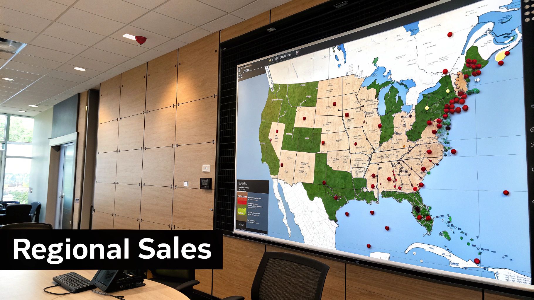
6. Territory and Regional Performance Dashboard
For organisations with distributed or field-based sales teams, the Territory and Regional Performance Dashboard is indispensable. It moves beyond individual rep metrics to provide a geographic visualisation of sales activities, outcomes, and opportunities. By mapping sales data onto specific regions, it allows leaders to analyse performance not just by person, but by place. This makes it one of the most strategic sales performance dashboard examples for companies aiming to understand market penetration and optimise resource allocation on a macro level.
This dashboard is critical for national or multinational corporations in sectors like telecommunications, energy, or field marketing, where success is heavily dependent on local market dynamics. It helps sales directors and regional managers answer vital questions: Is our top-performing territory saturated? Why is a seemingly promising region underperforming? Where should we deploy our next team of reps? This shifts the focus from purely evaluating rep skill to understanding the context of their environment.
Strategic Analysis and Tactical Insights
This dashboard’s strength comes from layering performance data over geographic information, revealing patterns that would otherwise be hidden in spreadsheets. It’s about comparing apples to apples while accounting for the unique characteristics of each market.
- Key Metric Breakdown: Core metrics include sales revenue per territory, lead conversion rates by region, and market penetration percentage. Instead of just seeing that Toronto is outperforming Vancouver, you can analyse why. Perhaps Toronto has a higher lead volume but a lower conversion rate, indicating a need for better qualification, while Vancouver has fewer leads but converts them more effectively.
- Heat Map Visualisation: The most powerful feature is the heat map. This allows for an immediate, intuitive understanding of performance. Red areas might indicate low sales or missed targets, while green areas highlight successful regions. This visual tool is far more effective for quick analysis in a boardroom than a table of numbers.
- Performance vs. Potential: A sophisticated version of this dashboard doesn't just show current sales; it compares them against market potential. By integrating demographic data or total addressable market (TAM) figures for each territory, you can distinguish between a team that's excelling in a small market and one that's underperforming in a large, opportunity-rich one.
- Resource Allocation Analysis: Track metrics like reps per territory or marketing spend per region and overlay them with performance data. This helps you identify if underperforming regions are under-resourced or if high-performing regions are becoming oversaturated and inefficient.
Actionable Takeaways for Implementation
Use this dashboard to drive data-informed territory planning and management. If a region shows high potential but low performance, it's a clear signal to investigate. The issue could be a need for more reps, better local marketing, or specific training to address regional challenges. Conversely, a consistently high-performing territory might be the ideal place to pilot new strategies or products.
Furthermore, use the regional insights to set more equitable and realistic sales targets. A blanket revenue target for all territories is rarely fair or effective. By understanding the unique potential and challenges of each area, you can create customised goals that motivate teams and reflect market realities. This approach is fundamental for managing effective field sales teams. Discover more about territory management for field sales teams on leadflowmanager.com.
7. The Real-Time Sales Alerts Dashboard
The Real-Time Sales Alerts Dashboard shifts the focus from passive analysis to immediate, event-driven action. Instead of requiring a manager to manually check a dashboard for updates, this system actively pushes critical notifications about sales events, opportunities, and performance anomalies directly to the relevant people. It acts as a central nervous system for the sales organisation, enabling rapid response to both promising opportunities and emerging problems. This is one of the most dynamic sales performance dashboard examples because it transforms data into instant, actionable triggers.
This dashboard is particularly vital for high-velocity sales environments like telecommunications, field marketing, or any business where speed is a competitive advantage. It helps teams capitalize on hot leads the moment they appear and address at-risk deals before they cool off. By integrating with communication tools like Slack or Microsoft Teams, it ensures that crucial information doesn't get lost in an overflowing inbox but is delivered where the team is already collaborating.
Strategic Analysis and Tactical Insights
This dashboard’s value comes from its ability to prompt immediate, intelligent action rather than just presenting historical data. It’s designed to interrupt the normal workflow with information that requires urgent attention.
- Key Metric Breakdown: The core metrics here are event-based triggers. Instead of tracking averages, you monitor specific occurrences like "New High-Value Lead Assigned," "Deal Stalled for 48 Hours," or "Competitor Mentioned in Call Notes." For example, an alert for a deal that has been idle in the "Proposal Sent" stage for too long can prompt a manager to check in with the rep and offer support.
- Response Time: This dashboard makes it possible to measure and optimize Alert-to-Action Time. How quickly does a rep follow up after receiving a new lead alert? How fast does a manager intervene when a performance issue is flagged? Tracking this helps you build a culture of urgency and responsiveness.
- Customisable Alert Logic: The power lies in customisation. Go beyond simple "new lead" notifications. Set up alerts for when a deal’s value is increased, a key decision-maker is added to an opportunity, or a customer from a target account visits your pricing page. This level of detail ensures every alert is relevant and high-impact.
- Role-Based Notifications: Not everyone needs every alert. A well-designed system sends notifications based on role and responsibility. A sales rep gets alerts for their own leads, a regional manager gets alerts for high-value deals in their territory, and a sales director might only receive notifications for deals over a certain threshold or critical team-wide performance drops.
Actionable Takeaways for Implementation
To implement this effectively, start small to avoid overwhelming your team with notifications. Begin with a few high-priority alerts, such as new lead assignment and major deal progression. Use the feedback from your team to refine the triggers and add new, valuable alerts over time.
Ensure every alert message contains actionable information. Instead of just saying "New Lead," the alert should include the lead’s name, company, and a direct link to the CRM record. This removes friction and allows for an immediate response. Finally, regularly review your alert criteria to ensure they remain aligned with your strategic priorities. As your business goals evolve, your real-time alerts must evolve with them to maintain their effectiveness and drive proactive sales behaviour.
8. The Sales Forecasting Dashboard
The Sales Forecasting Dashboard moves beyond tracking past performance and into the realm of predictive analytics. It combines historical sales data, the current pipeline’s value, and external factors like seasonality to generate accurate revenue predictions. This dashboard is one of the most strategic sales performance dashboard examples because it transforms sales data from a rear-view mirror into a forward-looking guide for business planning.
This dashboard is indispensable for leadership and finance teams in any organisation that needs to manage cash flow, allocate resources, or set realistic growth targets. It's particularly vital for companies in volatile markets or those undertaking significant expansion, like a solar consultancy planning seasonal hiring or a telecommunications vendor entering a new territory. It allows the business to make informed strategic decisions based on probable outcomes rather than gut feelings.
Strategic Analysis and Tactical Insights
This dashboard’s value comes from its ability to synthesise complex variables into a clear, defensible forecast. Instead of simply extrapolating from last quarter's revenue, it applies sophisticated models to provide a more nuanced outlook.
- Key Metric Breakdown: The dashboard should feature metrics like Forecast Accuracy (comparing past forecasts to actuals), Pipeline Coverage (the ratio of your open pipeline to your quota), and Weighted Pipeline Forecast. A weighted forecast applies a probability percentage to deals at each stage, providing a more realistic revenue projection than a simple sum of all open opportunities.
- Multiple Forecasting Models: Relying on one forecasting method is risky. A powerful dashboard allows you to toggle between models, such as a historical forecast (based on last year’s performance), a pipeline-based forecast, and even AI-driven predictions. This multi-model approach, used by platforms like Salesforce Einstein, provides a range of potential outcomes for better risk management.
- Scenario Planning: Advanced forecasting dashboards enable "what-if" analysis. Managers can adjust variables like win rates or average deal size to see the potential impact on future revenue. This helps in proactively planning for both best-case and worst-case scenarios, ensuring the business is prepared for market shifts.
- Incorporate External Data: True forecasting excellence involves looking beyond internal data. Integrate external factors such as market trends, competitor activity, and economic indicators. For a field marketing agency, this could mean factoring in local event schedules or seasonal weather patterns that impact foot traffic.
Actionable Takeaways for Implementation
To make this dashboard a reliable strategic asset, focus on continuous improvement and team-wide adoption. Regularly calibrate your forecasting models by comparing their predictions with actual results, and adjust the weightings or assumptions accordingly to improve accuracy over time.